|
How to use the color wheel
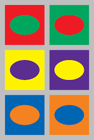
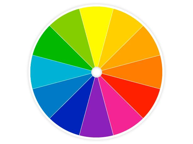
The color wheel is a visual representation of the colors found in a prism, arranged in a circle, with the primary colors (yellow, red, and blue) spaced evenly around.Artists of all kinds—painters, quilt makers, web designers, graphic designers, interior designers, etc—use it as a basis for working with hues, shades, and colors. It's a great tool to plan color schemes and color mixes. Why do i need a color wheel The color wheel is a great start for getting inspiration on what color combinations and hues to use. It simplifies the processes of creating harmony or contrast by helping to choose the right color schemes.Consulting this handy tool, artists can decide what color scheme they want to use by applying some geometrical methods, which means taking into consideration the distance between colors on the wheel. COLOR SCHEME Monochromatic One color and its tints, tones and shades Analogous Colors that are close to one another on the color wheel Complementary Colors that are directly opposite to each other on the wheel Split Complementary A color and then the two colors on each side of its complement Triadic Three colors that are equally spaced around the color wheel Tetradic Four colors that are two sets of complements Primary and secondary colors There are only three true hues: red, yellow, and blue. They are called primary because nothing can be mixed to produce them: they must be made or bought. With them we can make any other color, except white which is not an actual color. Primary colors are mixing pairs of primary hues, we get orange, green, and violet, which are called secondary colors. Mixing different secondary colors, you get chromatic neutrals, which is what you get when you mix all the primary colors in different proportions. While this effect is sometimes achieved unwilling, and takes the nick-name of "mud", it actually a great way to create low intensity, supporting hues. Kailey K
0 Comments
Without color, a sketch is left bland and unappealing to the eye, adding color can add a splash of life to your drawings. Color is a key to unlocking beauty in a project and can really give the picture a more realistic look. Colors come in many different forms, such as warm colors, cool colors, and contrasting colors. Warm colors include shades of Red, Orange, and Yellow, while the cool colors consist of shades of Blue, Green, and Purple. Contrasting colors are colors which are opposite to each other. Different shades of color can be used to signify the brightness of something. Color can also show emotion, brighter colors can signify happiness, while darker colors can show sadness or anger. Blue can display sadness, Red can express anger, and Yellow can show happiness. Using two contrasting colors with each other can create an art piece that shows conflicting emotions, a disagreement, or a conflict. In conclusion, without color, art would be severely different than it is now, there would be no emotion or feeling in a drawing or painting. There wouldn’t be nearly as much detail, and you couldn’t express your thoughts as clearly as you can with color. Austin G. Color Wheel Colors
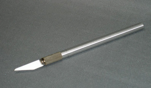
In class we are doing a project over the color wheel and we have to do it about the color theory. We have to use five of the topics on the paper she gave us. On to a game bored and we have to come up with the game. With each other in a group. We could pick any two games and we can put them together to make a new game. We have to pick a different name then what it is called. Color- property possessed by an object producing different sensations on the eye as a result of the way the object reflects or emits lights.(Red) Primary colors- any of a group of colors from which all other colors can be obtained by mixing. ( Red, Blue, Yellow.) Tertiary colors are- colors produced by mixing equal parts primary and secondary colors.(Yellow,Green) Complementary colors- Colors directly across from each other on the color wheel. Split-complementary- Venation of complementary colors using the two colors adjacent to its complement. Triadic Scheme- Use colors that are evenly spaced on the color wheel. Analogous color- 3-5 colors that are directly next to each other on the color wheel. Secondary color- a color resulting from the mixing of two primary colors (blue + yellow = green, Red + yellow = Orange, Blue + red = Violet) https://www.youtube.com/watch?v=koLRXIRZw7k (link to secondary color video) Warm colors- tend to advance in space and can be overwhelming(Red, Orange, Yellow) Cool colors- Are not overpowering and tend to recede in space. (Blue, Purple, Green) Monochromatic- different shades of one color. Bethany C. Color theory will help you build your brand. And that will help you get more sales. Let’s see how it all works. Color theory is both the science and art of color. It explains how humans perceive color; how colors mix, match or clash; the subliminal (and often cultural) messages colors communicate; and the methods used to replicate color. https://blog.hubspot.com/marketing/color-theory-design Primary Colors Remember hearing about primary, secondary, and tertiary colors? They're pretty important if you want to understand, well, everything else about color. When designing or even painting with primary colors, don't feel restricted to just the three primary colors listed above. Orange isn't a primary color, for example, but brands can certainly use orange as their dominant color. Secondary colors are the colors that are formed by combining any two of the three primary colors listed above. Check out the color theory model above -- see how each secondary color is supported by two of the three primary colors? https://www.colormatters.com/color-and-design/basic-color-theory Harmony In visual experiences, harmony is something that´s pleasing to the eye. It engages the viewer and it creates an inner sense of order, a balance in the visual experience. When something isn't harmonious, it's either boring or chaotic. At one extreme is a visual experience that is so bland that the viewer is not engaged. The human brain will reject under-stimulating information. At the other extreme is a visual experience that is so overdone, so chaotic that the viewer can't stand to look at it. The human brain rejects what it cannot organize, what it cannot understand. The visual task requires that we present a logical structure. Color harmony delivers visual interest and a sense of order. https://www.smashingmagazine.com/2010/01/color-theory-for-designers-part-1-the-meaning-of-color/ Cole H. 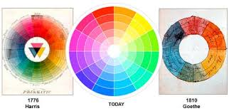 We learned about the opposite colors on the color wheel. The color wheel has all the colors on it like different shades of blues, reds, oranges, yellows, greens, purples etc. Red has an opposite color, which is green, all of the colors has an opposite color. A color wheel is a circle with differents shades of colors. Black nor white are on the color wheel, color wheels are used to show the relationship of the colors. Complimentary colors are colors in which they are used to cancel each other out. This means that when combined they produce a grayscale color, like white or black. They contrast for those particular colors. Blue and orange neutralize each other like red and green, yellow and blue etc. Placed by each other the color in a composition they create contrast and often vibration. The color wheel has the warm and cool colors. Cool colors are colors that are described as calm and soothing. Cool colors are not overpowering and tend to recede in space. Cool colors make space seem bigger. Warm colors are often hues of colors from red to yellow, to orange, to tans, to browns. Brown is an unsaturated warm color. Color theory is a body of practical guidance to color mixing and the visual effects of a specific color combination. The three examples are primary colors, secondary, and tertiary colors. The principles of the color theory includes the colors, red, yellow, and blue. Primary colors are the basis of the color wheel. Cole H. 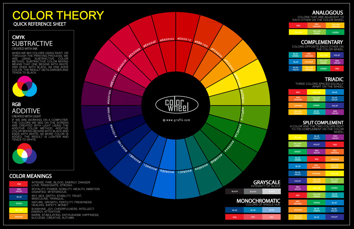 When it comes to art, sometimes it may occur that you need an exacto knife (or x-acto) to do your job. Exacto knives, if you use it wrongly, can put you at risk. It may look easy to use, but the knife can cause troubles like its razor falling off, not enough space to slice, cutting too fast, etc. Now, the first thing to is make sure the razor is tightened. Mainly injury could occur if you didn’t tighten the razor to the grip of the exacto. You could be cutting, then all of the sudden, the thing (blade) falls off. Another thing that could cause injury is to have the blade side appearing while walking. It is best to not do that, in case of any injury from nearby people walking. Also, third thing is do not horse play with them. They may be small, but can leave serious injuries if used wrong. You could be doing stuff like playing five finger fillet, throwing, tossing them can leave a serious mark and probably a pain of regret. Fourthly is to not distract someone who is using one. Same with the third one, you could be horse playing with a person while they are cutting and then w h o o p s, you're in trouble. So whenever someone is cutting, do not mess with them or, of course, injury will be against you and (mostly) your friend. Lastly of all I can think of is to make sure the blade is sharp. Flat tips will not do the job and may slip out of your cutting process. Even the sides, too. Make sure if your knife is correct. If not, seek help from the teacher. CITED- https://youtu.be/QmQuBM0H2PQ https://youtu.be/TC6HvR1Sqvo https://youtu.be/7xm-hVGFgMg Danny W.
Color theory is anything that involves color. Color is the property possessed by an object producing different sensations on the eye as a result of the way the object reflects or emits light. There are many different colors and types of colors. Some different colors are blue, green, and red. Primary colors are yellow, red, and blue. Secondary colors are green, violet (purple), and orange. Tertiary colors are colors that are produced by mixing equal parts primary and secondary colors. Examples of tertiary colors are yellow-green, blue-green, and red-violet. Complementary colors are colors directly across of each other on the color on the color wheel. Examples of complementary colors are yellow and violet, blue and orange, and red and green. Analogous colors are three to five colors that are next to each other on the color wheel. Examples of analogous colors are red, red-orange, orange, yellow-orange, and yellow. Monochromatic is different shades of one color. Warm colors are red, red-orange, orange, yellow-orange, yellow, and yellow-green. Cool colors are green, blue-green, blue, blue-violet, violet, and red-violet. Split-complementary colors are variation of complementary colors using the two colors adjacent to its complementary. Examples of split-complementary colors are blue, red-orange, and yellow-orange. “There are three basic categories of color theory that are logical and useful : The color wheel, color harmony, and the context of how colors are used.” says Colormatters.com. “Color theory is both the science and art of color.” says Kris Decker. “With colors you can set a mood, attract attention, or make a statement.” says Tigercolor.com. https://www.colormatters.com/color-and-design/basic-color-theory https://99designs.com/blog/tips/the-7-step-guide-to-understanding-color-theory/ http://www.tigercolor.com/color-lab/color-theory/color-theory-intro.htm Allen F.
Why Shading is important to Art
I like Shading because it adds value to a piece of work that otherwise would appear flat and bland.Shading also provides depth to an artwork and can sometimes add texture to an artwork. Shades are made by mixing a color with black such as Dark Blue being a shade of blue and Maroon Red being a shade of red. The opposite of this would be Tints which is the process of adding White to a color to make it lighter, for example if a light was shining on a red ball the area where the light is more concentrated would appear more lighter than the actual ball color but the area where light was not present would appear darker than the rest. So if you were to color the red ball you would have to use a lighter tint of red in order for it to appear as if there is light present but if there was no light you would mix your color with black to make the object appear as if it was in the shade. This is the reason i believe that shading it the most important part of any realistic drawing or painting. Marlin R An exacto knife is a knife designed for general use a chef’s utility knife especially a cutting tool having a sharp replaceable blade that can blade that can be retracted into a usually metal handle.
Always cut toward you and not away, so you have better control and so no one gets cut and make sure all fingers and other body parts are out of the way of your blade. Never use a knife that has a chip or crack in it, it may break off. If you need to change the blade give your exacto knife to Mrs.Grizzell, or whoever your teacher is. And if you have a loose blade turn the collar clockwise. The different parts of an exacto knife are the handle (what you hold on to), collar (the part you use to tighten, loosen, or remove the blade), collet (the part the holds the blade.), and the blade( what you cut with). Always make sure you sign out your exacto knife if you need it, and turn it back in. exacto knives are only use for cutting your material you need NOT a toy to play with or have sword fights. So remember to be safe when using your exacto knife. Anna m. Today we are going to talk about color theory! The color wheel has twelve different colors, starting with the three primary colors; red, blue, and yellow. These colors can be mixed to form all other colors. Then the secondary colors are green, orange, and purple. The primary and secondary colors mix together to form the tertiary colors; blue-green, yellow-green, red-purple, blue-purple, yellow-orange, and red-orange. The warm colors are red, yellow, and orange. The cool colors are green, blue, and purple. A color scheme may be based on analogous colors which are colors that are next to each other in the color wheel such as yellow-green, yellow, and yellow-orange. There are also complementary colors, which are colors that are directly opposite from each other on the color wheel. Some examples of this are red and green, blue and yellow, and purple and green. Split-complementary refers to any color on the wheel and the two colors adjacent to its complement such as blue-purple, red-purple, and yellow. Now with the colors there are different values. Hue refers to the specific color on the color wheel. Shade refers to a hue that is darkened with black and tint is a hue that is lightened with white. Saturation refers to the intensity of the color. Value refers to the lightness or darkness of the color. Monochromatic means something is done in only one color, but with different shades and tints. Works Cited https://www.colormatters.com/color-and-design/basic-color-theory https://www.youtube.com/watch?v=L1CK9bE3H_s https://www.canva.com/learn/color-theory/ Emily S. 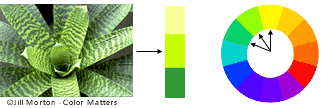 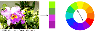 |
AuthorThis Blog will be kept and maintained by LHS Artists. Keep up with what's going on in the classroom and what artists we are currently studying! ArchivesCategories |

 RSS Feed
